Our Facebook page
Buy on GOG
Buy on Steam
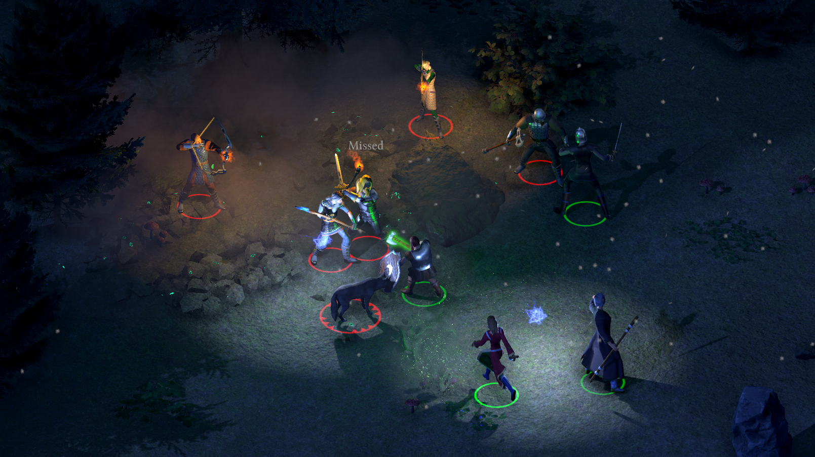
An isometric, party-based, RTwP game inspired by classics like Baldur's Gate and Icewind Dale available on
Steam
and
GOG
.